

1
2
3
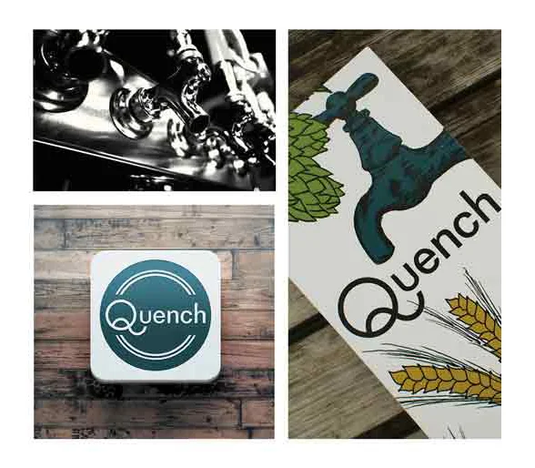
The logo created for this tasting room utilizes modern, simple elements drawing the focus to the letter forms. The Q in the logo is a custom letter form coupled with San serif letters to give it a clean look. Illustrations for the menu are composed of elements that are used to make beer. Typographic hierarchy of the beer menu distinguishes the various elements helping the customer to easily navigate through the various choices.